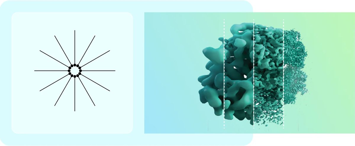
CEND, UC Berkeley. Making a research hub look as alive as its research.
The project in under a minute.
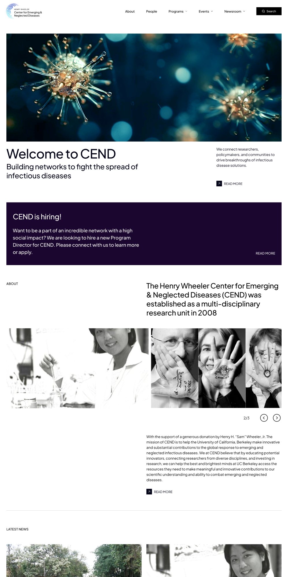
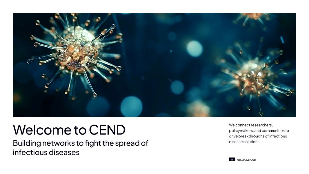
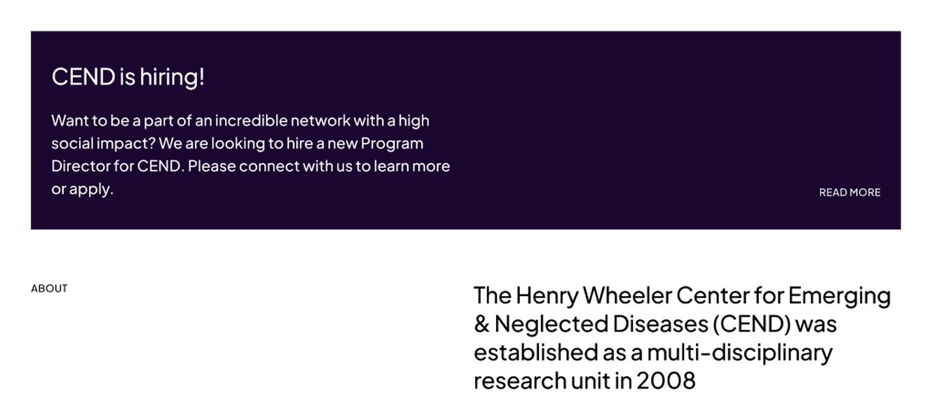
From a 2015 archive to a site built around what visitors come to do.
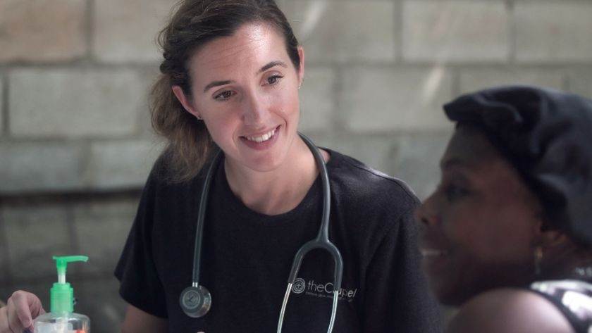
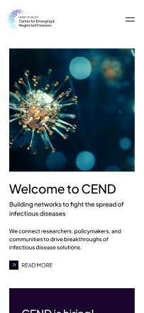
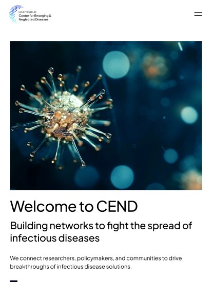
CEND brings together 60+ Berkeley researchers working on diseases that hit poorer communities hardest. We rebuilt the website from the menu down: clear pages, one consistent style, and every page designed for desktop, tablet and phone.
Visit website14
page layouts designed
4
screen sizes, desktop to phone
26
text sizes in one typeface
5
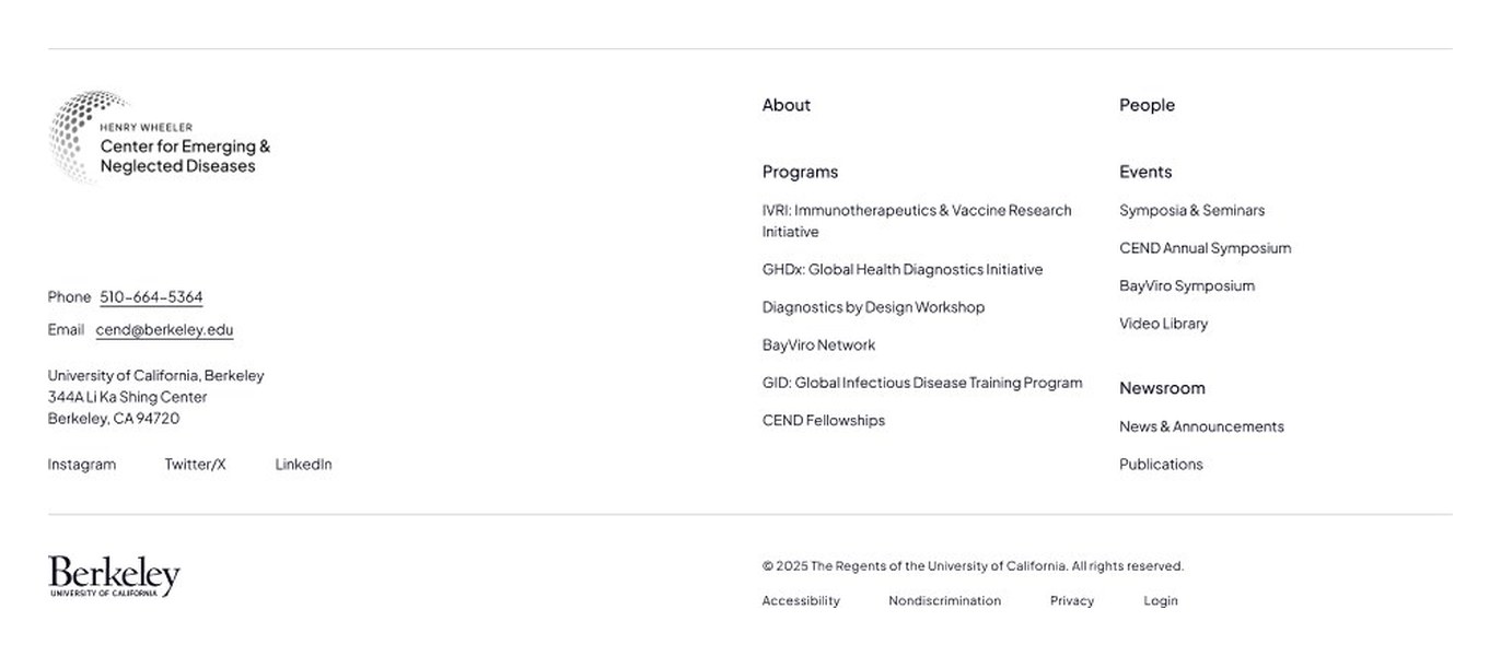
menu sections
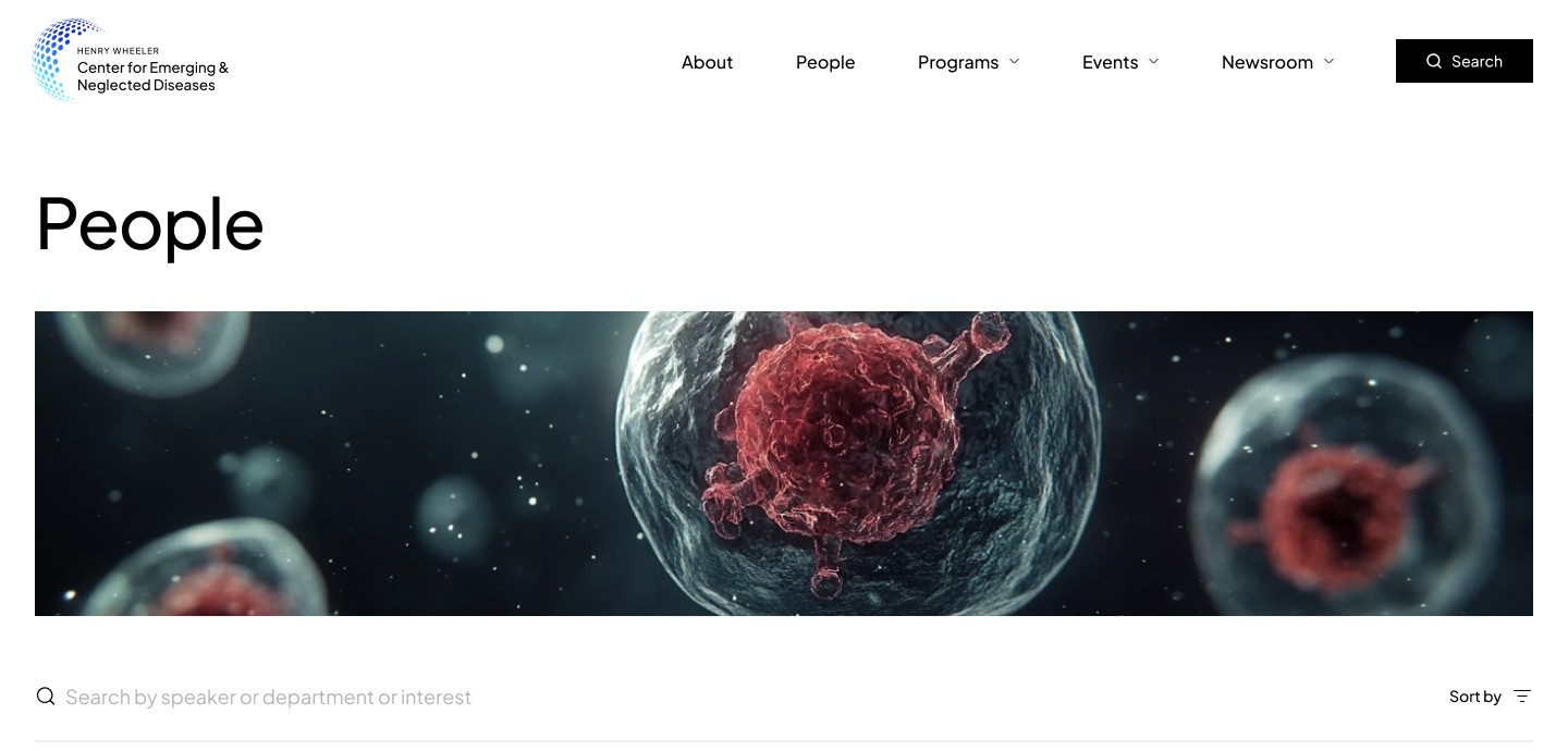
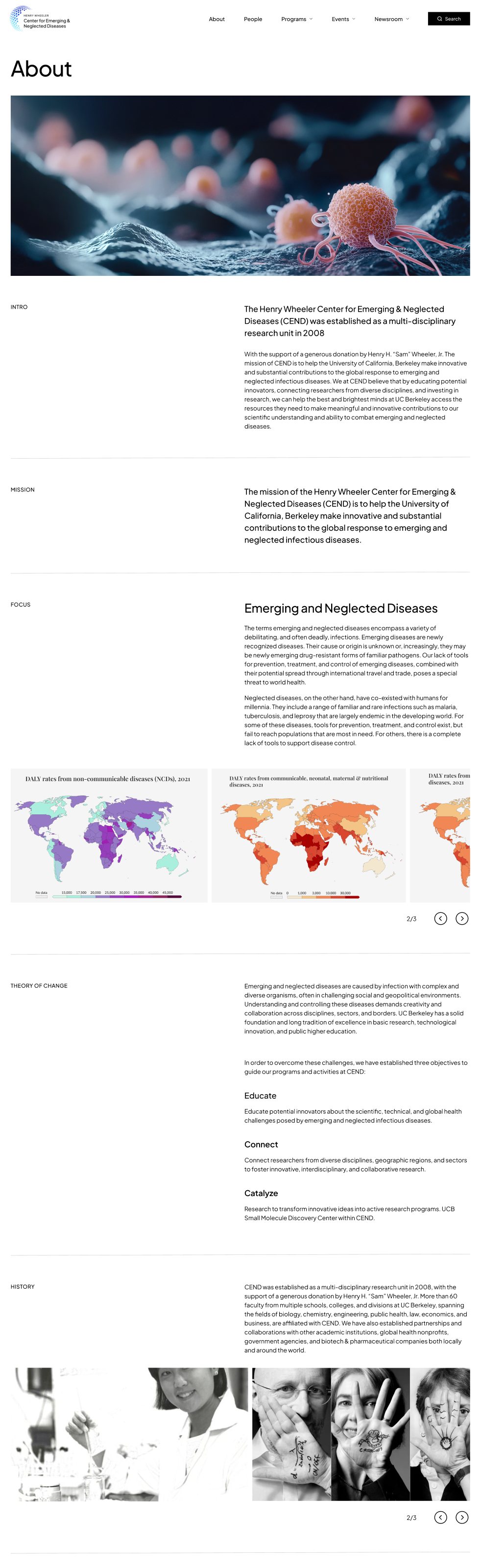
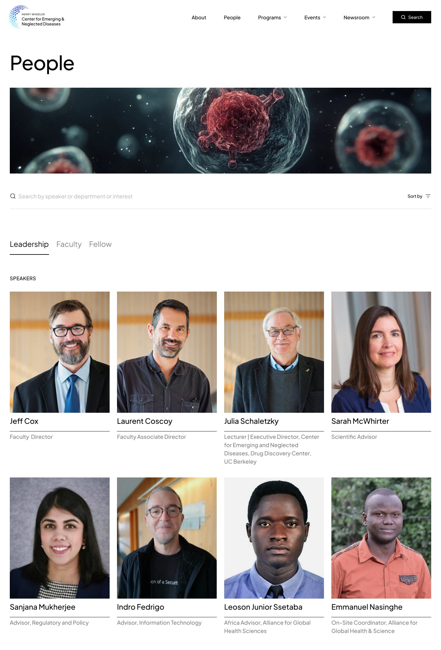
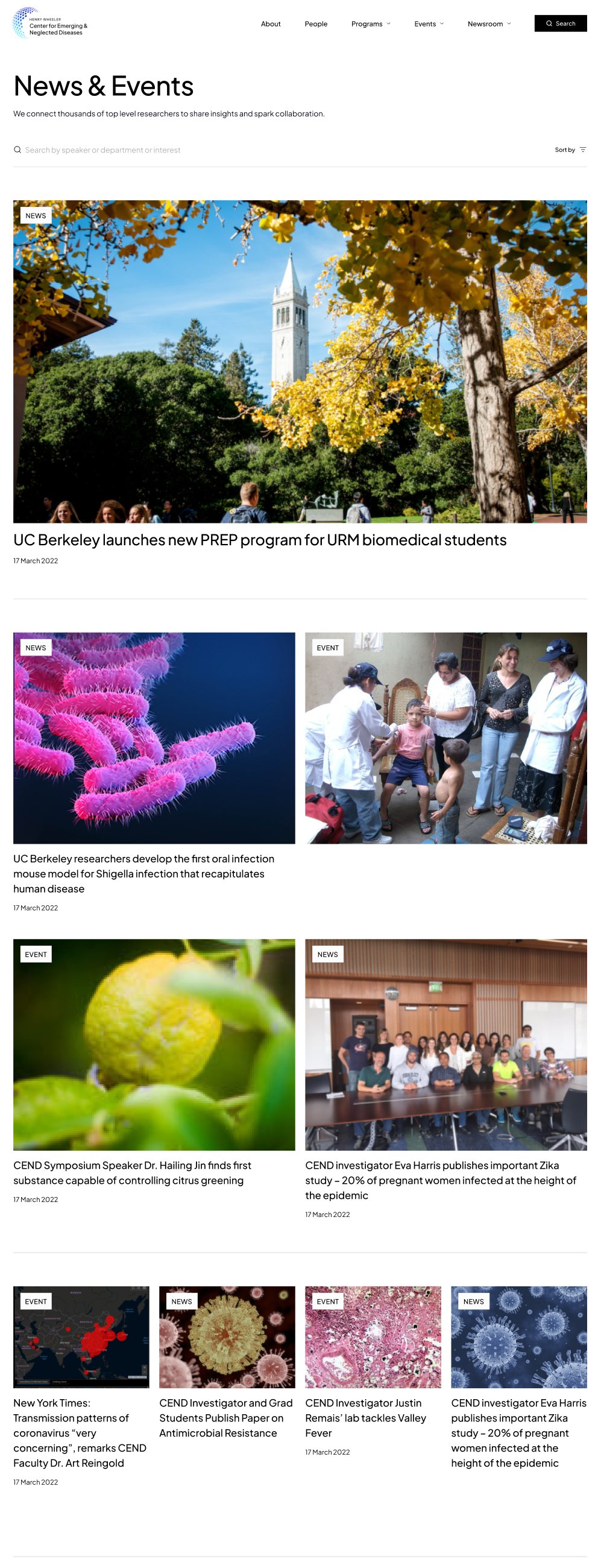
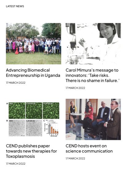
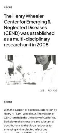





Small moments that make it feel quick.
Search narrows people and news as you type, matches are marked in the results, and menus open the way the design specifies. All built from the same type, colours and parts as the rest of the site.
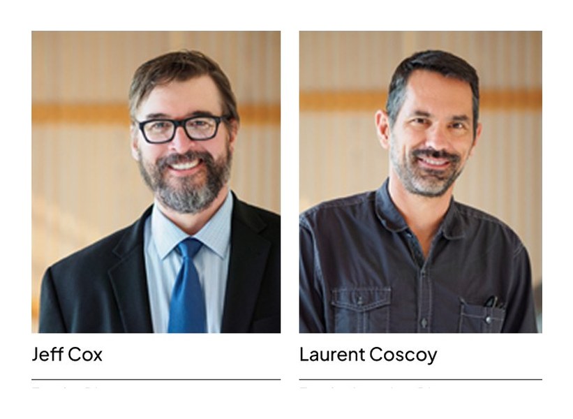
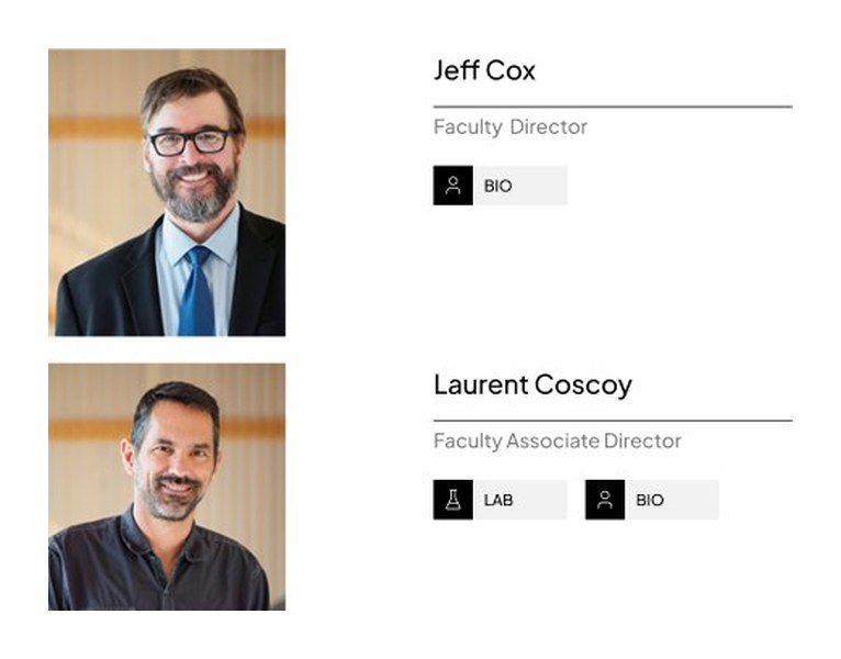
People search: results narrow as you type, then a profile opens from its card.
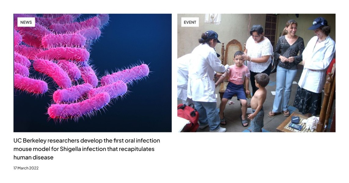
News & Events: the Programs menu, then search narrowing stories to the two Zika articles.
One system, every screen.
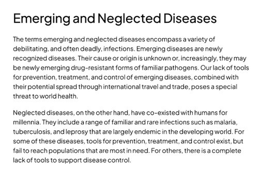
One typeface, black and white colours and steady spacing keep every page easy to scan. A profile, an event and a news story all use the same building blocks.